
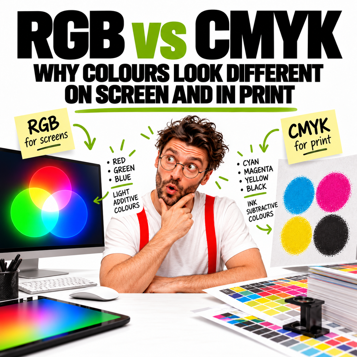
“It looked right on screen. So why does it look different in print?”
This does not necessarily mean something has gone wrong.
Screens and printed materials reproduce colour in fundamentally different ways. Understanding the difference between RGB and CMYK helps explain why colours can shift between what you see digitally and what ultimately appears in print.
What is RGB?
RGB stands for Red, Green, and Blue.
RGB is primarily used for content viewed on screens, including:
- Websites
- Social media graphics
- Digital advertisements
- Presentations
- Videos
- Email graphics
- Other screen-based applications
RGB uses an additive colour process. A screen produces colour using light, combining different amounts of red, green, and blue.
When these colours of light are combined at full intensity, they produce white.
Because screens emit light, RGB can reproduce some particularly bright and vivid colours.
What is CMYK?
CMYK stands for Cyan, Magenta, Yellow, and Key (Black).
CMYK is primarily used for commercial printing, including:
- Brochures
- Annual reports
- Posters
- Flyers
- Packaging
- Corporate stationery
- Publications
- Other printed materials
Unlike RGB, CMYK uses a subtractive colour process.
Instead of emitting light, printed colours are created by applying inks to a physical surface. Cyan, magenta, yellow, and black inks are combined in different proportions to reproduce the required colours.
RGB vs CMYK at a glance
| Comparison | RGB | CMYK |
|---|---|---|
| Stands for | Red, Green, Blue | Cyan, Magenta, Yellow, Black |
| Primarily used for | Screens and digital media | Print production |
| Colour process | Additive | Subtractive |
| Creates colour using | Light | Ink |
| Typical applications | Websites, social media, presentations, video | Brochures, publications, packaging, stationery |
Why do colours change when RGB is converted to CMYK?
RGB and CMYK do not reproduce exactly the same range of colours.
The range of colours that a colour system can reproduce is known as its colour gamut.
RGB can generally display a wider range of bright and highly saturated colours than standard CMYK printing can reproduce.
This is particularly noticeable with certain:
- Bright greens
- Vivid blues
- Intense oranges
- Fluorescent-looking colours
- Highly saturated colours
When an RGB colour falls outside the printable CMYK gamut, it must be mapped to a colour that the intended printing process can reproduce.
As a result, a colour that appears extremely bright on screen may look more subdued when printed.
That is a limitation of the reproduction methods — not simply a matter of changing four letters in a software setting.
Your screen is not the printed page
There is another important difference.
A screen emits light.
Paper reflects light.
This alone means that a printed piece cannot be expected to look exactly like an illuminated display.
Different screens can also display the same artwork differently depending on:
- Screen brightness
- Display technology
- Colour calibration
- Device settings
- Colour profiles
- Viewing environment
Your phone, laptop, and desktop monitor may therefore show slightly different versions of exactly the same colour.
CMYK doesn’t guarantee identical print results either
Converting artwork to CMYK is an important part of preparing many files for print, but CMYK values alone do not guarantee that every printed item will look identical.
The final result can also be affected by:
- Printing method
- Printer and press calibration
- Ink
- Paper or substrate
- Coated versus uncoated stock
- Surface finish
- Colour profiles
- Lighting conditions
A colour printed on glossy coated paper, for example, can appear different when printed on an uncoated stock.
This is why professional print production involves more than simply selecting CMYK mode.
What about Pantone colours?
For brand-critical applications, greater colour consistency may be required.
The Pantone Matching System (PMS) provides standardised spot-colour references that can help designers, printers, and brand owners communicate specific colours more consistently.
A Corporate Identity (CI) may therefore specify several versions of the same brand colour, such as:
- Pantone / spot colour
- CMYK
- RGB
- HEX for digital use
These specifications are not necessarily mathematically interchangeable. Each is selected to achieve an appropriate visual result within its intended medium.
This is one reason a properly developed Corporate Identity (CI) should include clear colour specifications rather than relying on a colour sampled from a logo on screen.
Which colour mode should you use?
Here’s a quick guide:
| Application | Colour mode |
|---|---|
| Website | RGB |
| Social media | RGB |
| Digital adverts | RGB |
| Presentations | RGB |
| Video | RGB |
| CMYK | |
| Corporate stationery | CMYK / Pantone |
| Publications and ARs | CMYK |
| Environmental graphics | CMYK / Pantone |
| Master Brand assets | RGB, CMYK, Pantone |
The final production requirements should always take precedence.
Some specialist printers, digital presses, and large-format production workflows may request files prepared differently.
Should you convert everything to CMYK yourself?
Not necessarily.
If artwork is being professionally designed or prepared for production, indiscriminate colour conversion can create additional problems.
Different conversion settings and colour profiles can produce different results. Converting files repeatedly between colour spaces can also be undesirable.
Where possible, provide the original, highest-quality source files and let your designer or production partner determine the appropriate preparation for the intended output.
What should you send your designer?
For an identity, publication, campaign, or other design project, provide the best available original assets rather than copying images or logos from websites, screenshots, or presentation files.
Where applicable, this can include:
- Original vector logo artwork
- Corporate identity or brand guidelines
- Pantone references
- Existing CMYK and RGB colour specifications
- Original high-resolution photographs
- Original illustrations and graphics
- Previous professionally produced artwork where relevant
And importantly, make sure the materials supplied are the current, vetted, final, and approved versions.
For more guidance on preparing materials before a project begins, see our Design Project Onboarding Checklist.
Why colour proofing matters
Where colour is particularly important, a physical proof or production sample may be recommended before final production.
A colour proof allows colour to be assessed in a form closer to the intended output rather than relying solely on what appears on screen.
For brand-critical applications, packaging, publications, environmental graphics, or large print runs, this can be an important part of managing expectations and reducing production risk.
The simple rule
RGB is primarily for screens. CMYK is primarily for print.
But professional colour management goes further than that.
The intended medium, printing process, substrate, colour profile, and brand requirements can all affect how a colour should be prepared and reproduced.
Good design therefore considers not only what a colour is, but also where and how that colour will appear.
Related Reading
- AI vs .AI Files: Why Your Printer Isn’t Asking for Artificial Intelligence
- Graphic Design in Singapore
- How to Develop Awe-Inspiring Annual Reports
- How to Brief Your Creative Agency
- Design Project Onboarding Checklist
More About What We Do
Our creative expertise spans four core disciplines:
Need help? Tell us about your project — email us or use our contact form.

