Design is a vital part of our everyday lives. It is found everywhere we look.
The food which we eat, the clothes which we wear, the smartphones which we use, and the vehicles which we drive – each and every one of these products went through years and years of painstaking and immaculate design.
In the world of publishing and advertising design, graphic design brings order and meaning to otherwise random combinations of text and photos. Advertisements, books, newspapers and brochures are carefully designed to convey information and influence their viewers and readers in the most compelling way possible.
Through the right combinations of facts, text and pictures, infographics help to enliven otherwise dull and complex pieces of content.
What are the elements of good graphic design? How can we apply these principles to our work in marketing and advertising?
10 Principles of Great Design
Let us begin by taking a leaf from venerated German designer Dieter Ram’s 10 principles of great design.
1. Innovative
Good design is innovative not for its own sake, but in tandem with the development of innovative technology.
An example of how design can be used in an innovative fashion is IDEO – a design-oriented company which seeks to improve and inspire lives through the power of design. Check out their Design & Ageing (D&A) Make-a-Thon held in Singapore, and how they gathered designers, coders, health and ageing experts over two days to build solutions for ageing gracefully in Singapore.
2. Useful
Good designs provide great utility. They are not just exquisite works of art that you admire behind glass showcases in a museum.
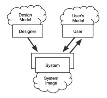
In the book The Design of Everyday Things by Don Norman, we learn how physical things like water faucets, doors and clocks are designed with the specific intent of making them highly useful. Designs only work well when the design model and the user’s model of the object can coalesce into an image of the system that the user can relate to (see below).
Courtesy of The Design of Everyday Things
3. Aesthetic
Good designs are beautiful and pleasing. They are conceptualised and created with the intent of encouraging people use them often. An ugly product, advertisement or book has no place in people’s hearts or minds.
In the world of typography, typefaces such as Baskerville and Helvetica may be unobtrusive and sometimes go unnoticed. However, these popular fonts are beautifully designed to fit their purposes. That’s why they are some of the best fonts on the planet.
4. Understandable
Good designs are easy to understand and relate to. You do not need an encyclopaedia-sized manual to learn how they work.
One of the best examples of this is the popular children’s toy LEGO. With highly intuitive interlocking plastic brick pieces cast in all manner of shapes, colours and sizes, LEGO has managed to capture the imagination of billions around the world with a timeless design that is easy to build with.
5. Unobtrusive
Good designs do not force a user to jump through learning hoops. While they may be good to look at, they are not ostentatious and overpowering to one’s senses.
A cool example of this is the Nest Thermostat. Amazingly tiny and innocuous, it blends in beautifully with any contemporary home, and does not draw attention to itself despite being aesthetically pleasing.
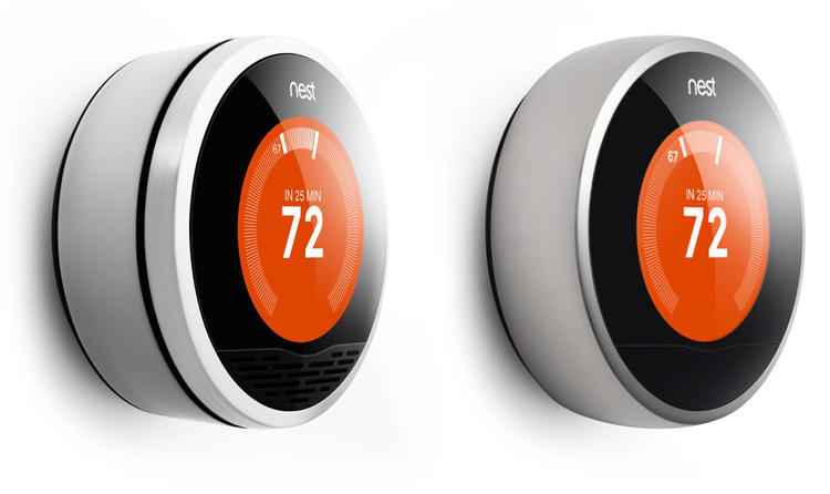
Courtesy of Fast Company Design
6. Honest
Good designs are honest and undeceiving. Well, at least in the nefarious sense. While a little make belief can be a positive diversion from the humdrumness of daily life, cheating your users by making them go round in loops is most unbecoming.
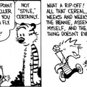
Just look at how disappointed Calvin is in this cartoon!
7. Long-lasting
Good designs are timeless and eternal in their appeal. Trends and fads tend to fade and disappear with the season. Like the little black dress, a good design will remain stylish regardless of the era, with only minor modifications needed to be updated.
A good example from the world of branding is the logos of companies which have lasted over the decades. Check out some of these iconic company logos.
![]() Courtesy of Creative Bloq
Courtesy of Creative Bloq
8. Detailed and Thorough
Good designs are meticulously conceived and created, down to the last full stop and corner. There is no “wastage” in a good design, and every possible angle is considered.
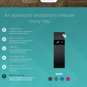
A good example of this can be seen in HubSpot’s example of 15 stunning product landing page designs. Some of the pages are so wonderful that you can literally eat them for lunch!
Check this example from Fitbit (click to enlarge):
9. Environmentally-friendly
Good designs are friendly to Mother Earth and uses the fewest resources possible. More importantly though, it asks the question of whether your product or advertisement would fit in well with the environment in which it is placed in. Does it stick out like a sore thumb or fit like a glove?
A good example of environmentally superior design is the wonderful Fuji Kindergarten. The roof of this oval-shaped preschool is like a playground which lets kids run forever.Fuji Kindergarten:
Fuji Kindergarten:

Courtesy of Ideas.TED
10. Have as little design as possible
Good designs have as little frills and excesses as possible. They are sometimes so simple that you forget that they were designed in the first place! Only design what is needed to make the product or visual communication stand out. No more.
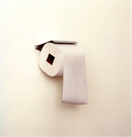
Kenya Hara’s redesign of the time-honoured toilet paper is a fabulous example of how a simple shift (from a cylindrical core to a squarish-shaped core) can provide so much utility. Just look at the photos below to see what we mean!
What other ideas for great design can you think about?

