
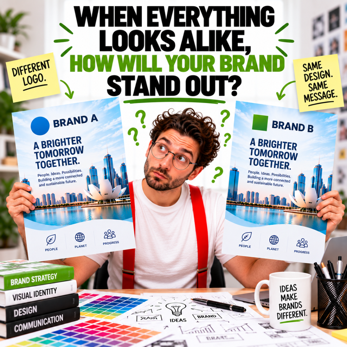
AI-generated visuals, ready-made website templates, and increasingly accessible design tools have made professional-looking content easier to produce than ever. But when different businesses begin to look remarkably similar, what happens to brand distinctiveness?
The rise of visual sameness
Scroll through social media, browse promotional posters, look at corporate brochures, or visit a few business websites.
Notice anything familiar?
The same visual styles. Similar layouts. Predictable typography. Familiar imagery. Identical-looking design treatments dressed up in different brand colours.
Many are attractive. Some are genuinely impressive.
But increasingly, they can be difficult to tell apart.
Artificial intelligence has made it possible to generate sophisticated visuals in seconds. Ready-made templates allow businesses to produce websites, presentations, brochures, and marketing materials with minimal design experience.
These developments have made creative production more accessible, affordable, and efficient.
And that’s a good thing.
But they also raise an important question.
When everyone has access to similar tools, templates, and visual styles, how does a business create something distinctly its own?
The logo-swap test: Could this design belong to anyone?
Here’s a simple test.
Take a promotional poster, corporate brochure cover, advertisement, or website.
- Remove the company’s logo.
- Now replace it with a competitor’s.
- Does the design still look perfectly at home?
Could the same brochure cover promote another company? Could the same advertisement work for a different brand? Could the website belong to almost any business simply by changing its logo, colours, and company name?
If so, what makes the original design distinctive?
This is what we call the logo-swap test.
It isn’t a scientific measure of design effectiveness, and not every piece of communication needs to be unmistakably branded. But it offers a useful way to question whether a design genuinely reflects the organisation behind it.
A logo identifies a business.
The design surrounding it should help communicate what makes that business recognisable, relevant, and different.
If changing the logo is all it takes to change the brand, perhaps the design was never particularly distinctive in the first place.
Website templates: Different businesses, familiar faces
Website templates are among the clearest examples of visual sameness.
Visit enough corporate websites and familiar patterns begin to emerge.
Oversized headlines. Full-width hero images. Rounded content cards. Predictable icon sets. Similar animations. Identical page structures.
Change the company name, swap the photographs, adjust the brand colours, and another website is ready to go.
There’s nothing inherently wrong with templates.
They make website development more accessible and can provide sound foundations for usability, navigation, responsiveness, and accessibility.
The problem arises when the template becomes the creative direction rather than a starting point.
A website should communicate more than what a company does. It should help visitors understand who the company is, what it stands for, and why it deserves their attention.
When design decisions are driven primarily by what’s readily available, businesses risk looking like everyone else.
A familiar layout may help people navigate a website. But a distinctive brand experience gives them something to remember.
AI didn’t invent generic design. It made producing it easier.
Visual sameness existed long before generative AI.
Stock photography, clip art, presentation templates, desktop publishing, and online design platforms have all influenced how businesses create marketing materials.
AI is the latest advancement in that evolution.
And it’s a significant one.
Today, businesses can generate illustrations, campaign concepts, product imagery, and sophisticated compositions with remarkable speed.
But faster production doesn’t automatically lead to stronger communication.
When creative direction is reduced to popular prompts, trending aesthetics, or attractive visual references, the results can become interchangeable.
The issue isn’t that AI cannot produce original work. In capable hands, it can contribute to highly distinctive creative outcomes.
The issue is what happens when convenience replaces consideration.
When the question becomes “What can we generate?” rather than “What do we need to communicate?”, the result may look impressive without expressing anything meaningful about the brand.
The problem isn’t AI. It’s the absence of creative direction.
Looking good isn’t the same as communicating well
Consider a corporate brochure.
An attractive cover may catch someone’s attention. But does it reflect the organisation’s character? Does it establish the right tone? Does it make the intended audience want to discover what’s inside?
What about the pages that follow?
Are the messages clear? Is the information logically organised? Can readers quickly identify what matters? Does the design help them understand and remember the content?
The same questions apply to annual reports, infographics, presentations, promotional posters, and advertising campaigns.
Good design involves more than choosing attractive imagery and arranging text. It requires understanding the audience, defining communication priorities, establishing visual hierarchy, and making deliberate creative decisions.
Sometimes the most effective solution is bold and expressive.
Sometimes it’s quiet, restrained, and remarkably simple.
The objective isn’t to make everything look different for the sake of being different.
It’s to make the communication appropriate, recognisable, and effective.
Distinctiveness goes beyond the logo
A strong brand isn’t built by placing the same logo on different pieces of artwork.
It develops through a coherent visual and verbal language that audiences come to recognise.
Typography, colour, imagery, composition, illustration, messaging, and tone of voice all contribute to that recognition.
So does consistency.
A corporate brochure shouldn’t feel disconnected from the organisation’s website. A campaign shouldn’t appear to belong to an entirely different business. An infographic shouldn’t sacrifice clarity simply to follow a fashionable visual trend.
Each touchpoint has its own communication requirements, but together they should reinforce a recognisable brand.
This doesn’t mean every design must look identical.
It means the work should feel connected by a clear sense of purpose and identity.
Your logo tells people who you are. Your communication should give them reasons to remember you.
When creative tools become commonplace, thinking becomes the differentiator
The democratisation of design tools has changed the creative industry.
Businesses can now produce materials that once required substantial time, technical expertise, and production resources.
That’s progress.
But having access to professional-looking output isn’t the same as having a considered communication strategy.
Creative expertise involves asking questions before making design decisions.
- What is the business trying to achieve?
- Who needs to receive the message?
- What makes the organisation different?
- What should the audience understand, feel, remember, or do?
- Which visual approach will communicate most effectively?
These questions matter whether the final work is produced using traditional design software, AI-assisted tools, or a combination of both.
Technology can accelerate execution. But it doesn’t remove the need for judgement, direction, and accountability.
The value of good design isn’t measured simply by how quickly something can be produced, but by how effectively it communicates.
More content. More noise. Greater need for clarity.
Businesses today face no shortage of ways to create content.
Posters can be generated in minutes. Brochures can be assembled from templates. Websites can be launched using ready-made layouts. Social media graphics can be produced in seemingly endless variations.
Yet audiences still have limited attention. And attention alone isn’t enough.
Effective communication must build understanding, recognition, and trust.
Producing more content doesn’t necessarily strengthen a brand if every piece looks interchangeable or lacks a clear message.
As visual production becomes increasingly accessible, businesses have an opportunity to reconsider what they’re really investing in.
- Not simply another poster.
- Not merely another brochure.
- Not just another attractive image.
But communication that serves a purpose and contributes to a recognisable identity.
Where strategy meets creative impact
At JAB Design, we believe effective creative work begins with understanding what needs to be communicated — and why.
As a strategy-led branding and creative agency, we bring together business thinking, creative judgement, and purposeful design to help organisations communicate with clarity and distinction.
AI will continue to evolve. Design tools will become faster, smarter, and more accessible. But producing more content is not the same as creating more meaningful communication.
When everything looks alike, the real advantage lies in knowing what makes your brand different — and communicating it effectively.
AI has made it easier to create. It hasn’t made it easier to be distinctive.
Related Reading
- Why AI Can’t Fix a Confused Brand
- Why Great Design Starts with Better Questions
- Do I Need Branding or Just Design?
- Building Stronger Brands
- How to Brief Your Creative Agency
More About What We Do
Our creative expertise spans four core disciplines:
Need help? Tell us about your project — email us or use our contact form.

